Screenshots that can't go stale: how every release redraws its own user guide
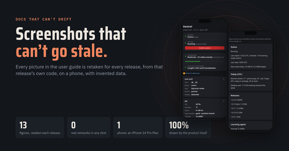
Open almost any product's help pages and you'll find the same bug. The text says "tap Settings". The screenshot shows a button that was renamed two versions ago, on a screen that no longer looks like that.
Nobody decides to let docs drift. It happens because retaking screenshots is tedious, so it gets done once, at launch, and then quietly falls behind.
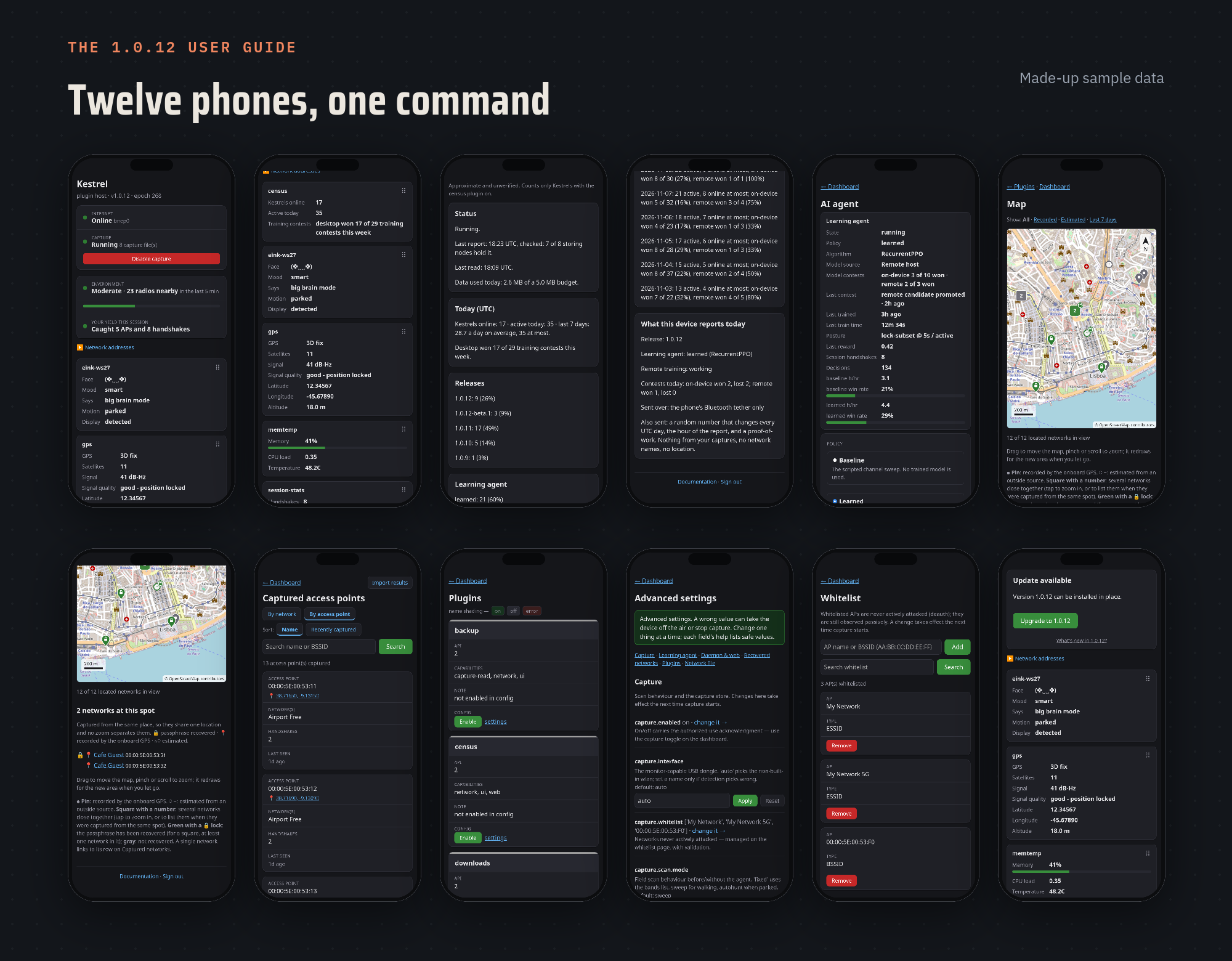
For Kestrel's user guide, I wanted pictures that can't fall behind. So nobody takes them by hand. Every release redraws its own guide: every picture is retaken from that release's own code, on a phone screen, with invented data, and published together with the text it illustrates.
Kestrel is my nights-and-weekends project, built with Claude as my AI teammate: an open-source Raspberry Pi device for authorized Wi-Fi security research, with a dashboard on your phone. It's unaffiliated with my employer, and the views here are my own.
How a guide picture is made
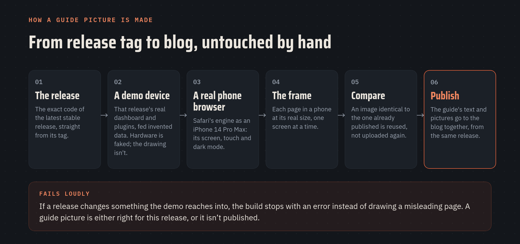
- The release, exactly. The tool takes the code of the latest stable release straight from its tag, never a work in progress. Betas never reach the public guide.
- A demo device. It starts that release's real dashboard and plugins on the computer, with the hardware parts faked: no Wi-Fi adapter, no e-ink screen, no GPS. The drawing isn't faked. Every label, layout, card and number format on screen comes from the product's own code.
- A real phone browser. It opens each page in Safari's engine as an iPhone 14 Pro Max: the real screen size, touch layout and dark mode, because that's what most readers will hold. Each picture is one screen, scrolled to the part that matters, inside a phone frame. The e-ink face is drawn by the e-ink plugin itself, at its real resolution.
- Compare, then publish. A picture identical, pixel for pixel, to the one already on the blog is reused, so a release that didn't change a screen doesn't re-upload it. The guide's text and pictures then go up together, from the same release, so they always agree.
The guide's page is never edited by hand on the blog. If someone does edit it there, the tool notices and refuses to overwrite it without being told to.
It fails loudly
The most important design choice is what happens when something doesn't fit. If a new release renames or removes something the demo device relies on, the build stops with an error. It doesn't draw a page that looks plausible but is subtly wrong.
That paid off this week. Release 1.0.12 added a census plugin that needs one more software library. The first time the demo device was pointed at 1.0.12, it refused to start: the new plugin wouldn't load, and a guide showing a broken plugin is worse than no guide. One line in the tool's requirements fixed it. Without the loud failure, the guide would have quietly shown an error card where the census should be.
Everything in the pictures is invented
The device studies Wi-Fi networks, so a real screenshot would be full of other people's network names and locations. None of that goes anywhere near the guide:
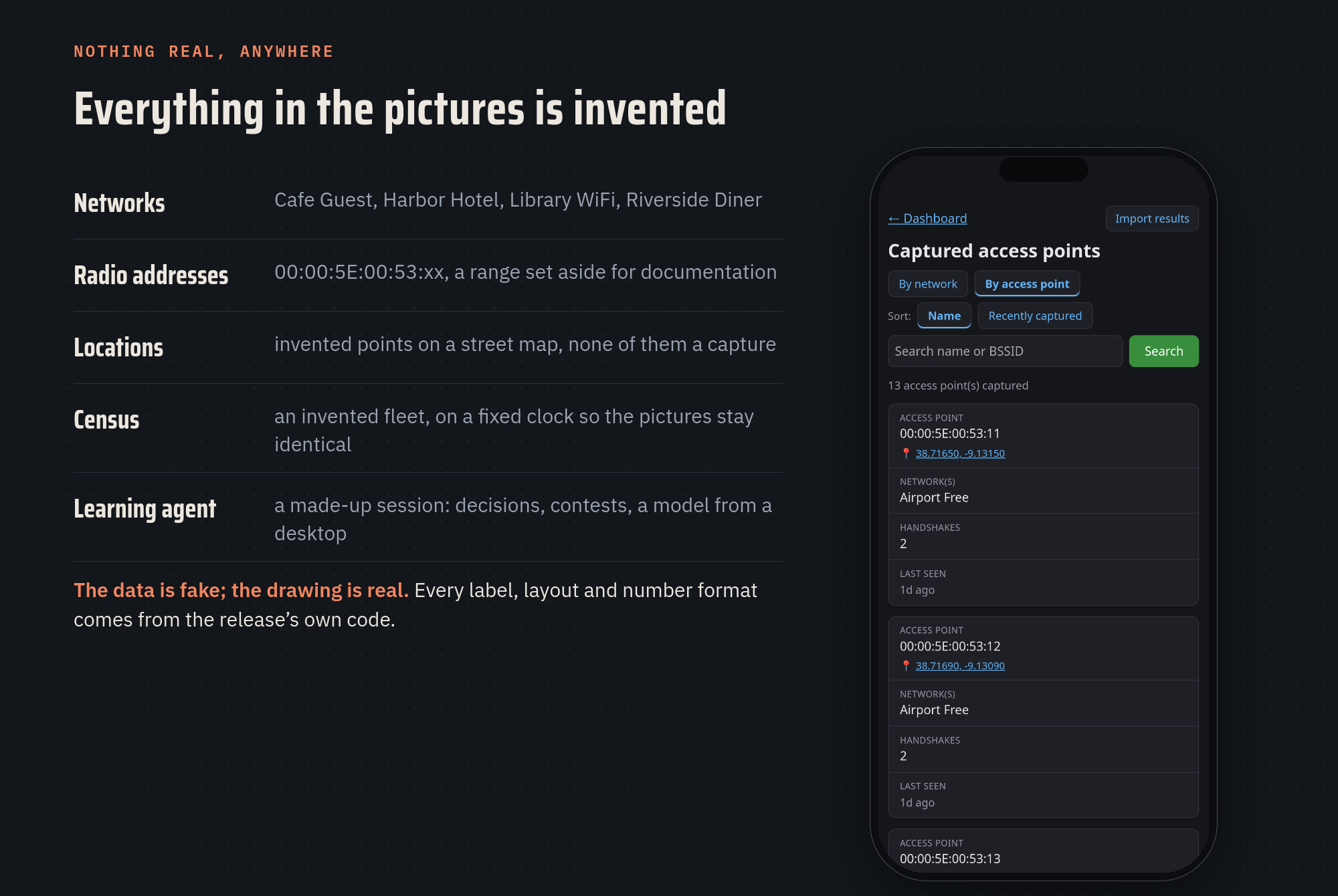
The demo's data is written for the job: fictional cafés and hotels, radio addresses from a range reserved for documentation, invented points on a street map. Anything that prints a time or a date, like the census, runs on a fixed clock, so the pictures come out identical every run and are only re-uploaded when the product really changed.
The new rule: every feature ships with its pictures
A pipeline only helps if new features use it. So it's now written into the project's rules, the operating manual my AI teammate reads at the start of every session:
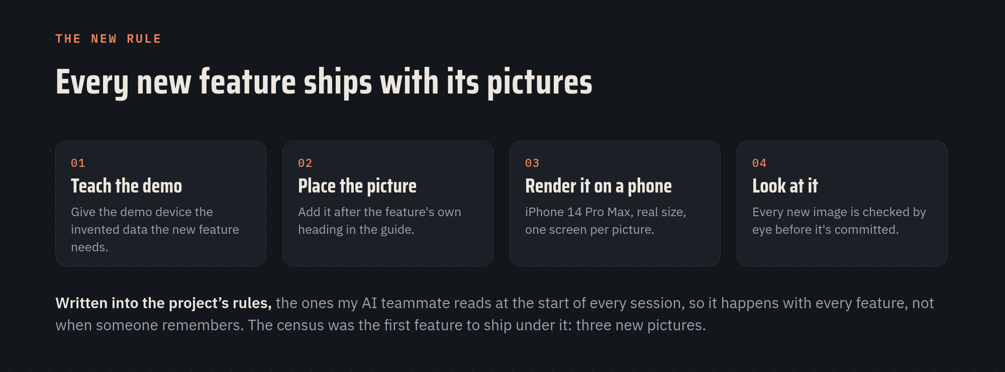
Any change that adds a feature people see, or visibly changes one, now does four things in the same change: gives the demo device the invented data the feature needs, adds the picture right after that feature's section in the guide, renders it on the phone, and gets looked at before it's committed.
The census was the first feature to ship under the rule, with three new pictures: its dashboard card, the Census page, and the part that spells out exactly what the device reports. Adding them turned up one more bug in the tool itself: when several pictures followed the same heading, they came out in reverse order, which had quietly swapped the two map pictures for a while. Now they keep the order they're listed in.
For product and engineering leaders
- Make the right thing the automatic thing. Docs drift because updating them is a separate chore. Tie them to the release and the chore disappears.
- Prefer a loud failure to a plausible wrong answer. It applies to documentation as much as to code.
- Write the rule down where the work happens. A rule in the place every session starts from gets followed every time, not when someone remembers it.
Working with an AI teammate is what made the pipeline worth building. The tool, its demo device and its tests are the kind of internal tooling a small project normally can't justify. Here it was cheap to build, and it pays off every release.
For investors
Documentation is part of the product. Out-of-date docs mean more support tickets, slower onboarding and a quiet signal that nobody is minding the details. A team whose docs regenerate from the shipping product has turned a recurring cost into a fixed one. It's a small thing to ask about: "when did your screenshots last change, and who changed them?"
If posts like this are useful to you, subscribe and the next one lands in your inbox.
When did your team's screenshots last match the product? 🪶
Kestrel is a personal, open-source project built on nights and weekends, unaffiliated with my employer, and for authorized testing only. The user guide and source are public.
Member discussion